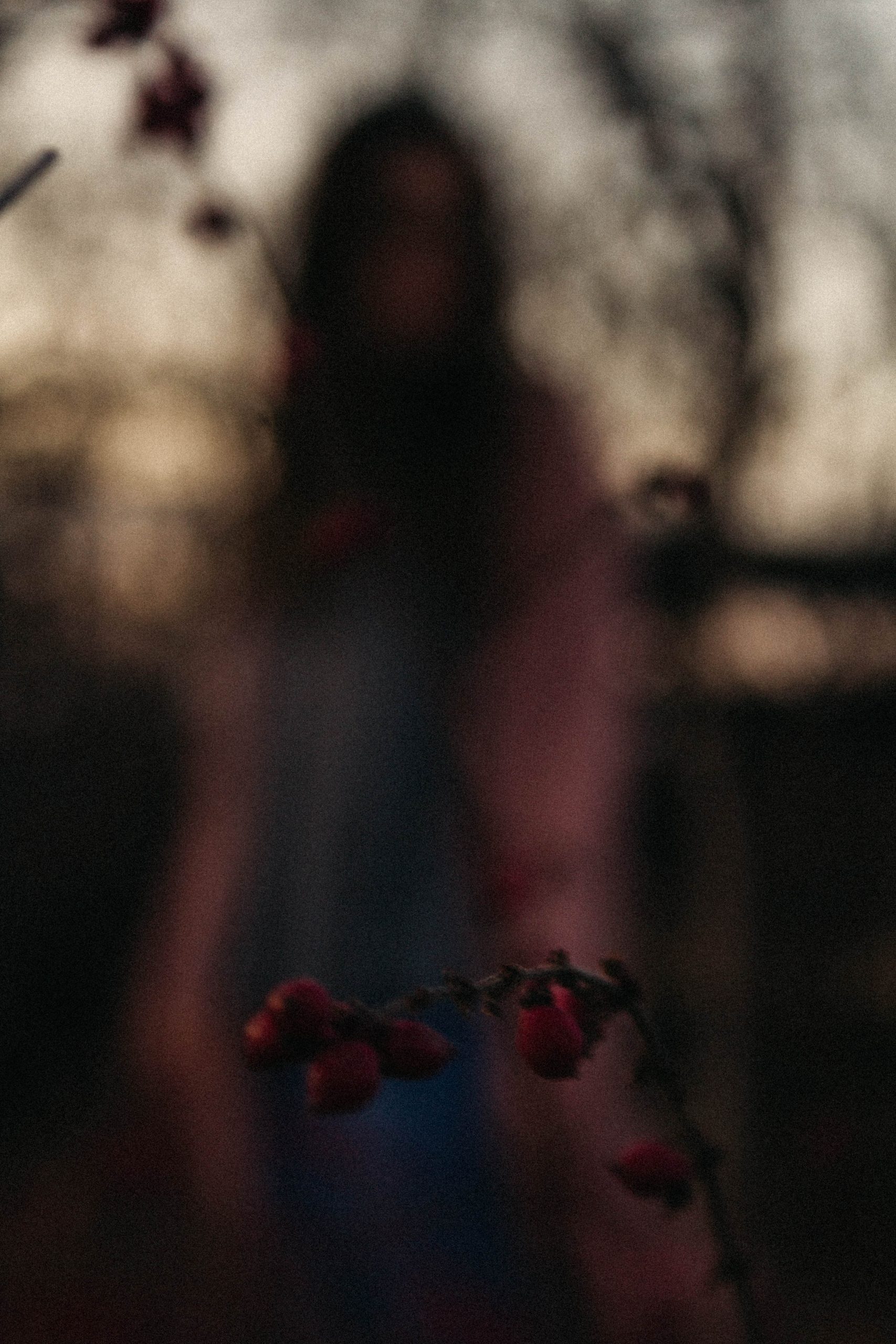
 Religion
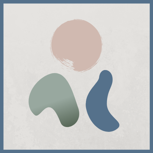
Our Logo
We created our logo for Simply Unland and thought it would be fun to explain the logo a bit since it is a bit abstract. This logo was actually created a long time ago, Caleb created it I think soon after we started dating. The colors were different, I think they were yellow, red, and blue. Definitely not as aesthetically pleasing but really loved the idea of the different elements. In this post we will explain why this is our logo and what it means to us.
The sun/Son: we both believe that Jesus is the Messiah, He is the light of the world. He is God’s one and only Son, who died on the cross for our sins. Without God Caleb and I would not have the boldness to create Simply Unland, heck we would not be alive without him. So it was very important that we included God into our logo.
The mountain: Caleb and I met at Glorieta New Mexico, which is in the mountains. But that also holds so near and dear to my heart. I found God really for the first time at Glorieta and also Colorado. I moved to Washington and tried to go to the mountains often, it was still and quiet so I was able to hear and feel God’s presence. I know God is with me wherever I go but the noise of the every day life makes it hard to hear and feel His presence.
The wave: this is all Caleb, I like beaches and swimming but also somewhat afraid of the ocean. However, sometimes I feel like Caleb has gills and fins because he can stay under water for forever and can swim super fast. Caleb also loves the sound of the waves and the stillness of the water. He says it is very peaceful, a place that is so mysterious and majestic, just like our Heavenly Father.
We are a very adventurous couple and love going out of our comfort zone and want Simply Unland to reflect that so I hope you guys enjoyed this little read, and continue to stay tuned for more content coming your way.